Here’s a little job that makes such a big difference. The client supplied their new logo and it was due to be used on a whole host of promotion print including a new van. We needed to make a few alterations to ensure the logo would print well and last well on a sign written van.
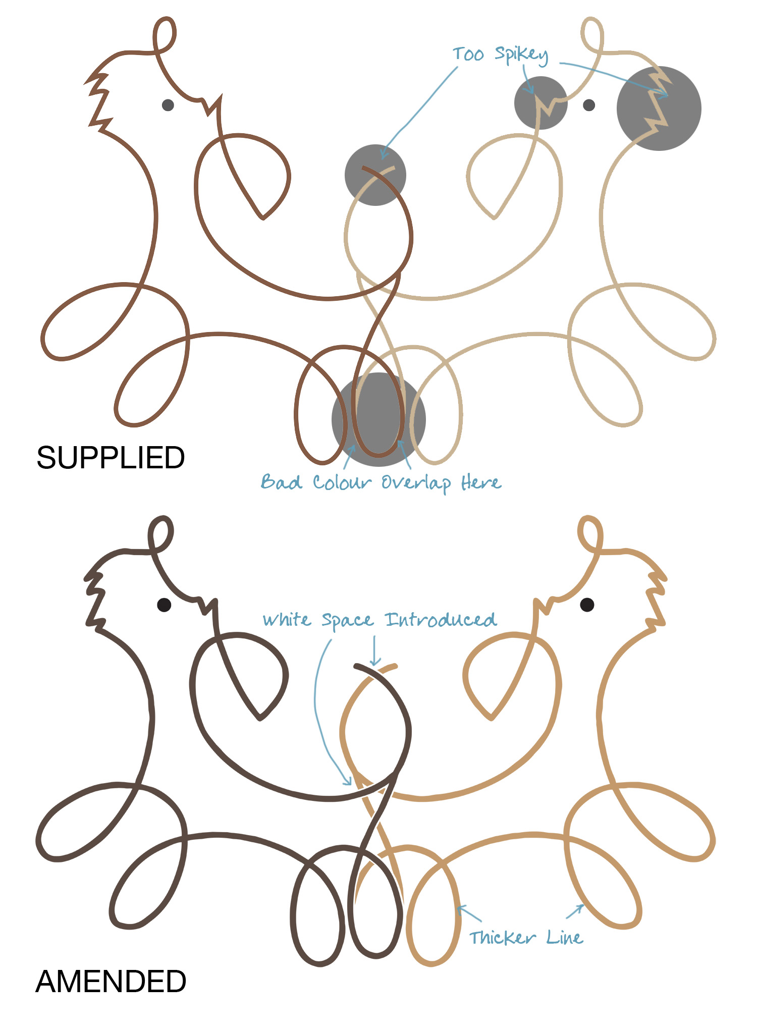
1. The supplied logo had a bad overlap on the paws of the dogs – you could see the two colours. This was fixed.
2. There were numerous elements, within the supplied design, that were too spikey. Ok for printed stationery and the website, but for the graphics on the van these would pull up in general use – or even if the van was later taken into a car wash; so we fixed all the sharp points.
3. The outlines were a little thin, so we made them thicker again to ensure they last longer on the van.
4. Finally, to avoid any overlaps with the printed vinyl on the printed van, we introduced a thin space between the two dog outlines.
Job done – and van graphics that are now off to be printed and applied. Thanks to these few little amendments the van will stay looking great for years.
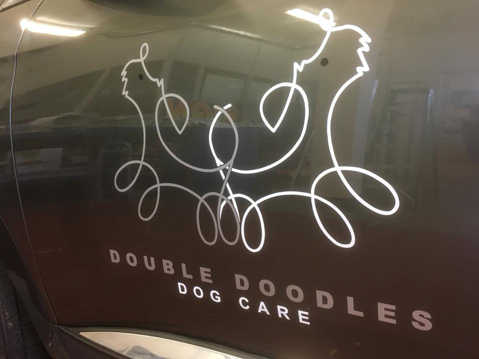
UPDATE: Here’s the finished logo applied to the vehicle.

