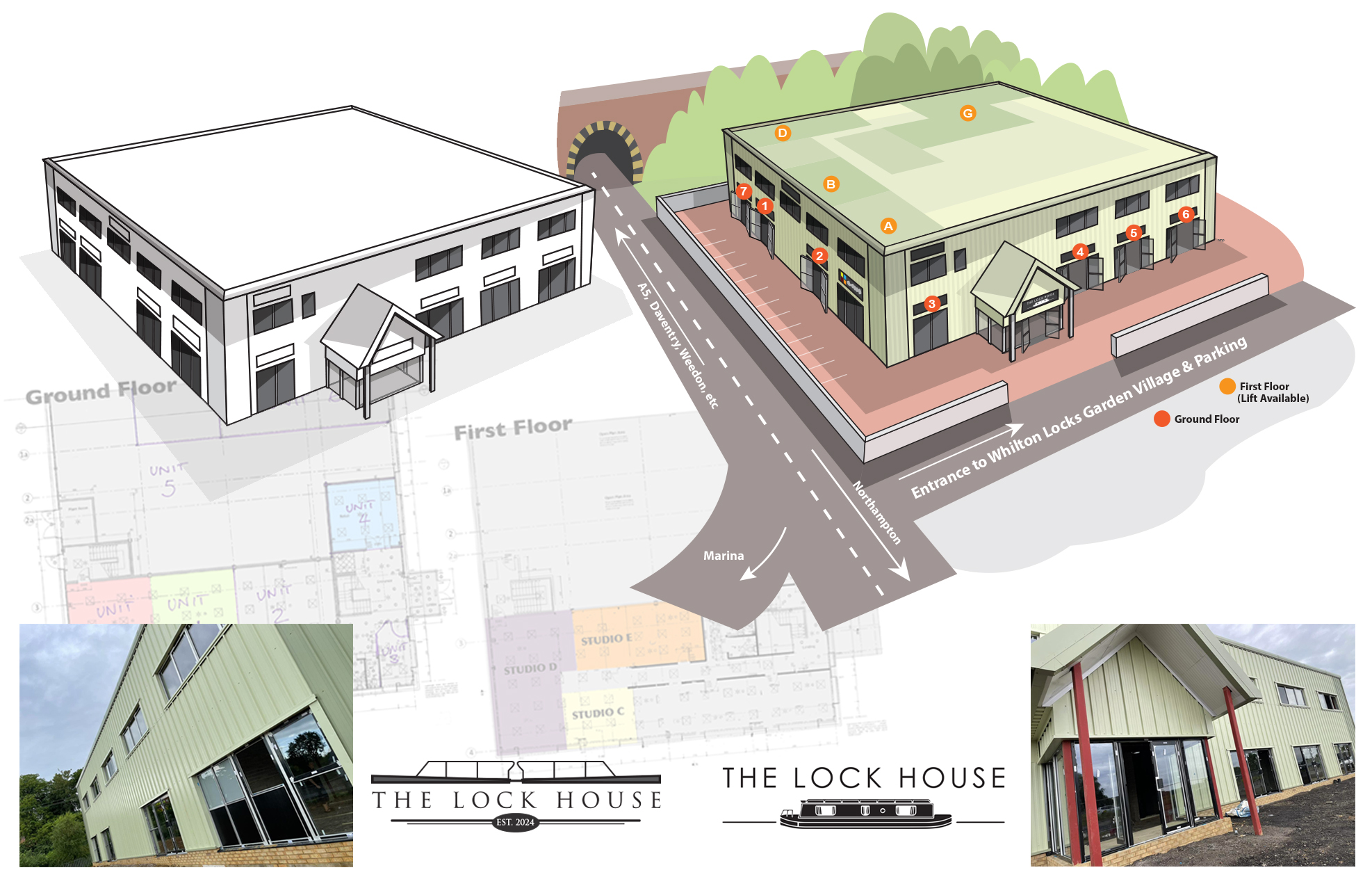
The Lock House is a brand new structure located at the entrance at Whilton Locks.
The building is now home to a number of independent businesses so we wanted a strong method of showing the location of each retailer within.
For this it was important to have a higher viewpoint as there are two floors. With this higher view we could map out the exact position for each unit – thus easier for customers to locate.
Our initial drawing (left) was extended to include the local environment with the railway bridge being a prominent visual location reminder.
The drawing was coloured and we even use the wording of ‘green building’ within our text to help. Finally we can open and close each doorway to either feature one particular retailer or all at the same time.
Our logo (bottom left), which featured a profile of the actual lock just a few metres away, was not taken forward with the final chosen logo shown on the right.
You can’t win them all!
